


Attention Fonts!
Now and again, I’m getting reports about missing symbols, not consistent icons so. Migrating to icons is not a good option for me. First, we already have a lot of symbols. Also I have planned some additional symbols for governments and others. It would be pretty big amount of pictures, especially, if you are planning to use different states. It could be a problem if you are using different Gnome Shell themes you can use too light or transparent styles for the panel. Icons could looks pretty odd or just be invisible on background. Second, I think I’m a bit Designer and always wanted to create a custom font. I’m still in a progress :)
I was frustrated when I started to dig around a font’s creating on Linux (I mean OS not the kernel. Actually, it’s a bit annoying when people think Linux is just a kernel. Where would Linux Kernel be without basic Linux packages beginning from GCC and ending with grep or wget). I thought it would be not too difficult, especially, when there is able such tools like Inkscape and so many open fonts in general. First searching on WEB and I found a modern-looking written on Vala BirdFont application for a font editing and creating. I have downloaded and compiled it. I tried to quickly do things there. But it was unusable at least for me.
Actually, I have a huge experience of working in different kinds of CAD applications. I worked in different PCADs, 3D Modeling CADs, CADs including Autodesk products, even GIS-es. I worked on TV like 3D content and advertisement creator when I was a student yet. I done a lot projects for AutoCAD, GIS and other related products professionally later.
I couldn’t even delete some path’s points and couldn’t find any documentation how-to do that simple thing. It’s like you should just press Delete key but there is Backspace, I found in a few hours, days!!! I was so disappointed and tried to learn it from some video tutorials so. I spend a lot time to learn BirdFont, made some things including tinkering with some online font-generators and decided to leave it for better time.
My mistake was to use BirdFont. It's looking nice but you can't get a good documentation to start with it. So interface is absolutely not intuitive and not familiar to any other graphic packages. All UI is just icons! It's Okay but they are absolutely static for all working session. They don't have even hovering, they don't changing visibility or sensitivity. You have to understand what they mean from short tool-tips only. There is more, you should press some sentences of icons to achieve some results. Same thing with a context menu, it's just a list some mix static actions where you can't find Delete action! One think you shouldn't use it, later version is proprietary.
I should tell something good about BirdFont. First, it has an old open-source version. Second it has auto vectorization from bitmap images like scans. But the vectorization is requiring manual editing anyway, no batch processing and that characters is trivial and more convenient to do in Inkscape for an example. One more good thing is filtering unicode symbols by text name description and preview results.
When I back to a font creating it was a long time later. Also I forget all things about and started from scratch.
Power of fonts!
There are a lot of benefits of using custom fonts in your application.
- There is much less code. You don’t have to handle loading and keeping pixel buffers. You’re just working with simple text strings.
- You’ll get scalable vector graphics.
- All things are excellent ordered and stored in one place.
- Convenient styling. You can easy apply text’s CSS styles including all supported features like font-size, RGBA colors, text shadows and more.
- Consistent look for your application on different color themes and DPI.
Maybe here is more benefits. Tell something in your comments!
Creating custom fonts
I found FontForge editor is very useful even it has some ancient GUI. It’s like I should rewrite/port it to Gtk2 at least (I can do it :).
Basic workflow
- Creating a font project from any existing font (TTF, OTF) or just new one.
- Creating/Editing font symbols in vector editors like Inkscape.
- Import SVG sources back to FontForge and validate them (check for errors).
- Export a project to desired font format.
- Optionally, here could be more specific font tunings.
During this how-to, we’ll create our first Hello font from scanned handwritten word image!
First things to know about fonts
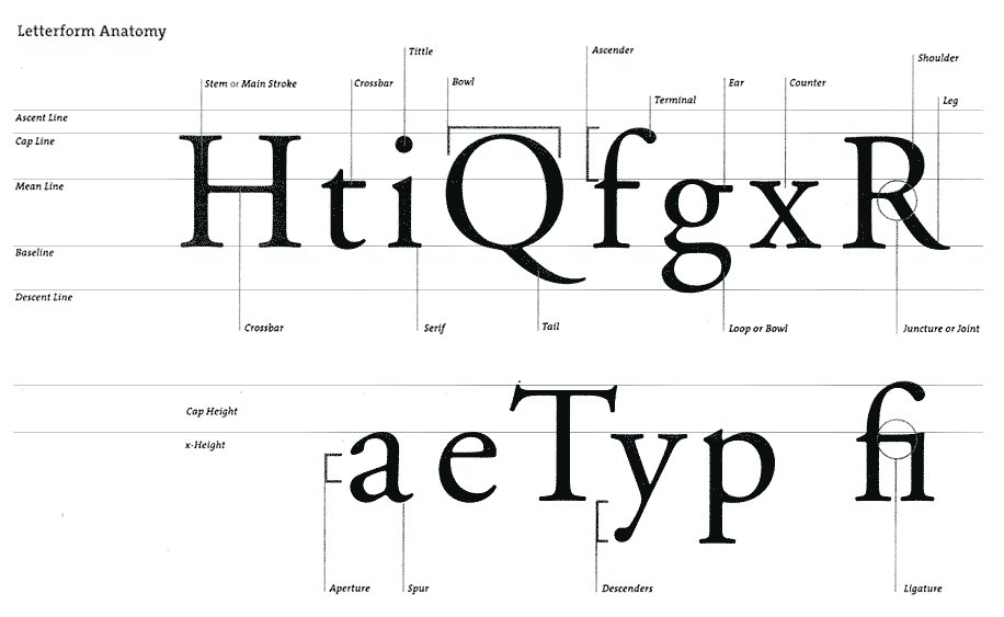
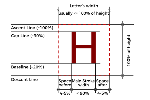
Actually, for basic things you should get a bit less things. You can see just one letter on the picture below. Generally, standard fonts have:
Baselineit’s zero line to what aligned almost all letters excluding some special characters and symbols.Descent Lineit’s space below 0 point for letters with tails like g,p,y. I have noticed all standard fonts have that space around 20% to an example for font matrix 1000x1000 pixels, it’s 200px. Keep in mind it’s an optional space and you can use it, especially for symbols. But it’s better idea to have that line because if you will have missing characters in your font, font cache manager will insert some default font and your symbols could look awkward. So you can use this space anyway for your symbols. It’s just a conditional line.Cap Lineit decline the highest letters height.Ascent Lineother optional conditional space for accents or other special symbols and characters. Usually it’s about 10% for our font matrix in 1000 px it’s 100px.Letter widthit should be the same as height for mono-space fonts like in terminals. For all other situations it’s less or equal to the height.Space before and afterusually, the Space Before it’s fixed number and less then Space After to align all characters vertically on each line.Main Stroke Widthit’s variable and can be smaller or lager then height.
Now, we’re ready to go ahead and create our Hello font.
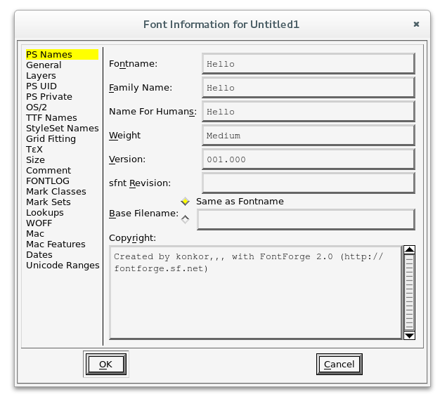
Setup a New Project in FontForge
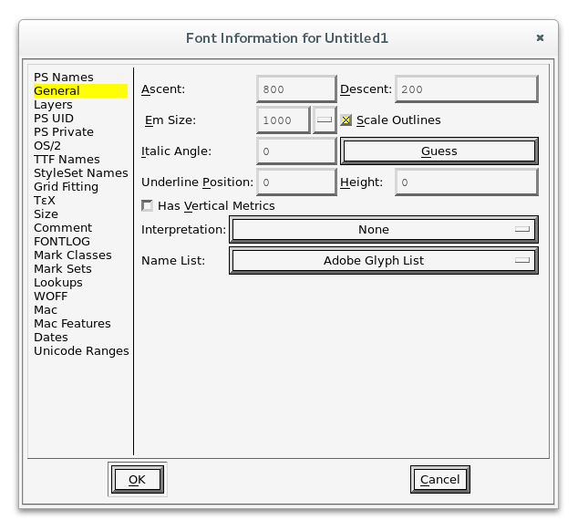
Here is all simple. Just press File -> New... to create an empty project. Now go to Element -> Font Info... to setup a basic font description and settings. Enter Fontname and other desired parameters.
Now, open General Tab to fill basic font parameters like:
Em Sizeit’s 1000px height by default. It’s pretty convenient value to start and calculate other parameters. Some high quality fonts have 2048px, some less 256px to an example.Ascentwe’ll use 800px. It’s height from Baseline to the highest top line.Descentwe’ll use 200px. It’s exactly 20% of full size. So our font will do not look too weird in mix of other fonts.- All other parameters fill with 0 for this project.
Now go to File -> Save menu to save our project to desired location. And we’re ready to go further.
Design our font in Inkscape
We could make some abstract font directly in Inkscape but we’re going to create special font :) I wrote Hello!!! on the paper, made photo of it and imported to Inkscape. I think you have some experience in vector graphics editing. So in couple minutes I get this:
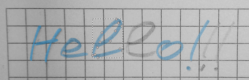
I know my handwriting is awful.
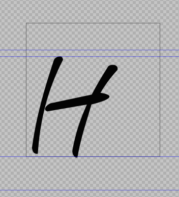
Now, we are ready to transfer each letter on SVG template and import to our FontForge project. SVG template is just plain SVG (not Inkscape SVG) document with our width and height. So you can just find and open it similar font in FontForge and open some character and make Export of it and you will get some life example.
Here are a few things you have to follow:
- Whole symbol should be a single path even if it are separated objects. Just select all paths and join them in the path’s menu.
- Path shouldn’t contain strokes just filling with black color.
- You have to save results as
plain SVG, otherwise FontForge couldn’t parse it. SelectSave As...in Inkscape.
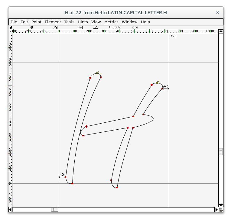
After importing into FontForge, you have to select all nodes and move a symbol to its place, drag the end guide to the right side of the symbol and reserve space after it. Optionally, you can do many other adjustments inside FontForge like scaling, rotating, editing…
FontForge has a lot of documentation and huge amount of video tutorials for any kind of tasks. I found a lot of videos about in my new project - NewStream. It's Youtube player for Linux. You could join to testing. So there are available DEBs packages for all flavors of Debian like Ubuntu/Mint/Elementary etc
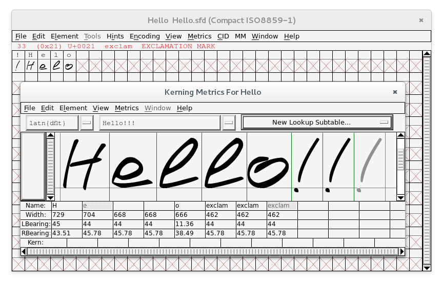
So after importing all symbols, you could switch to Compact view mode to see just our symbols (Encoding -> Compact) and check how it looks like in Window -> New Metrics Window....
If all looks well you have to validate and save our project. Choose Element -> Validation -> Validate... to fix some warnings and errors like not integer coordinates or missing helpers.
Finally, you can go to File -> Generate Fonts... and generate to desired font format your own font!
Hello!!!
Links
- FontForge Hello.sfd
- WOFF Hello.woff used on this page
- Video tutorial for dummies
PS: It’s a huge topic and it can’t cover all aspects. I will wait for your responds, comments, and experience of creating fonts on Linux. I’m still learning things it’s fun!
Perhaps it’ll help to someone.